©MINUAGE 2014-2025

Aranya Jinshangling Honey
阿那亚金山岭蜂蜜
CAT. Packaging Design
CL. Aranya
CD. Chang Shi
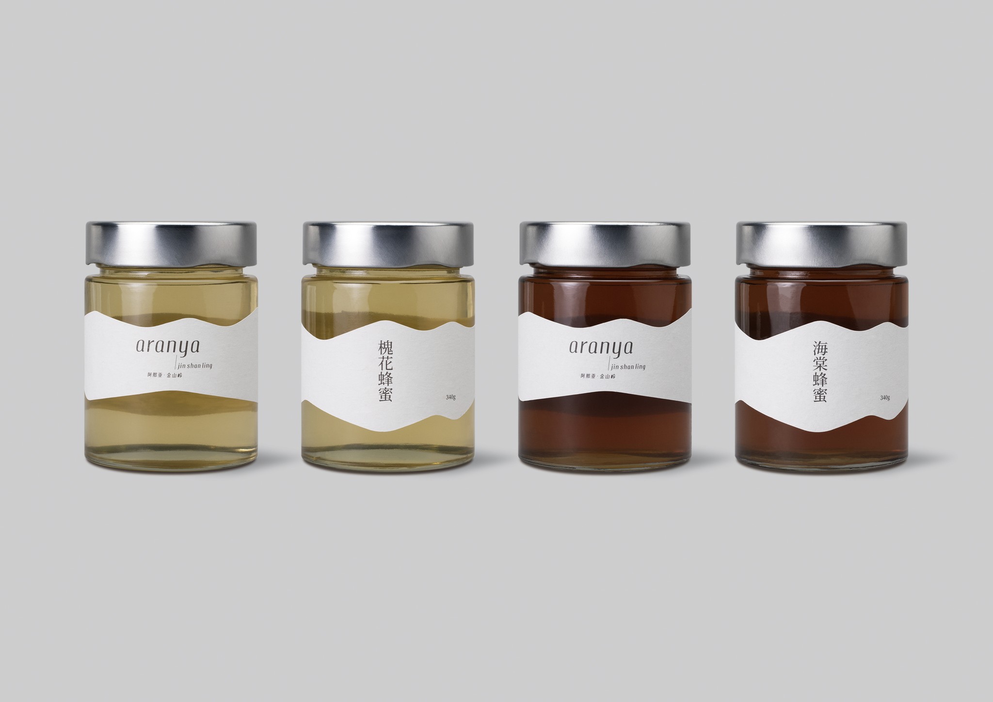
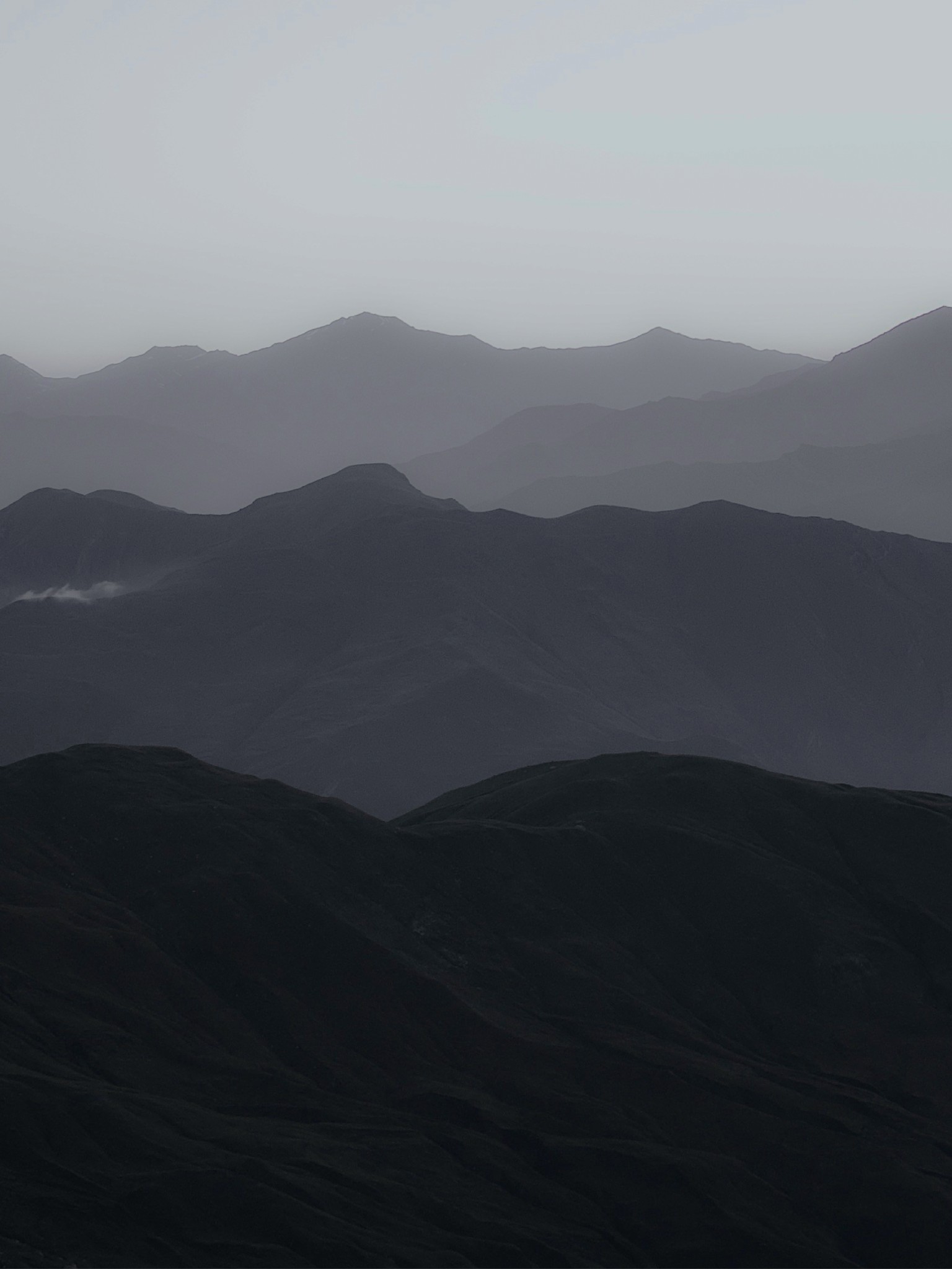
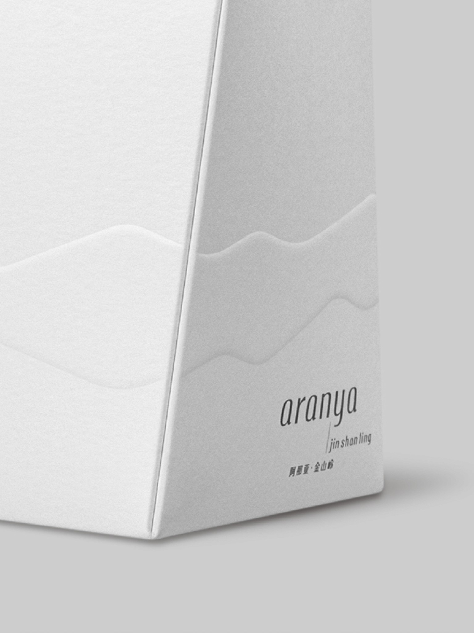
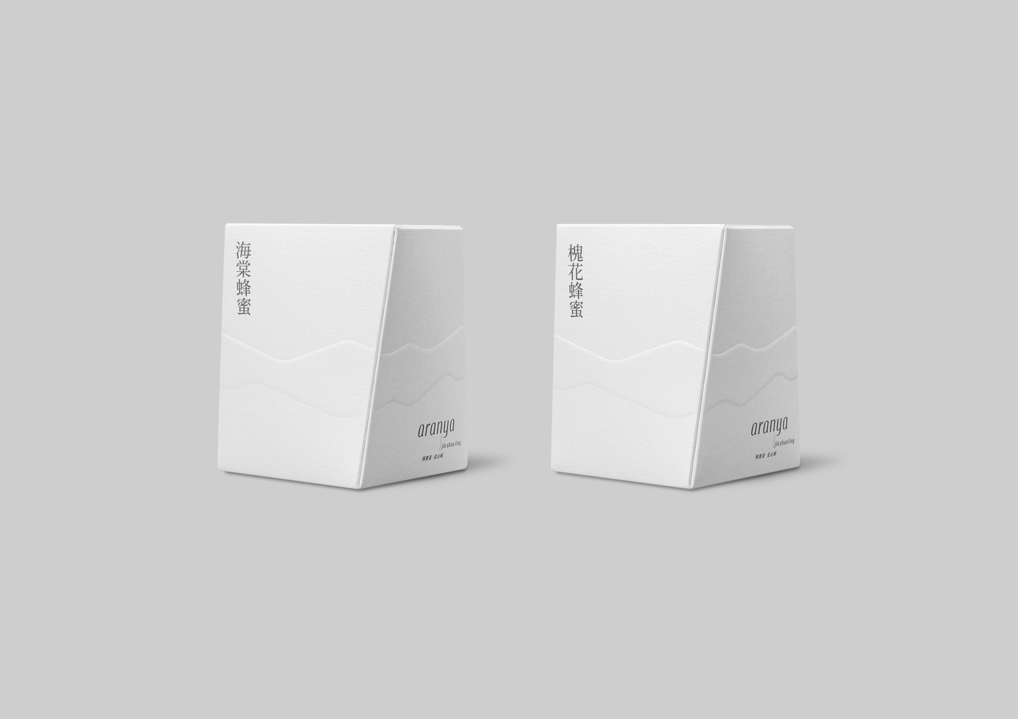
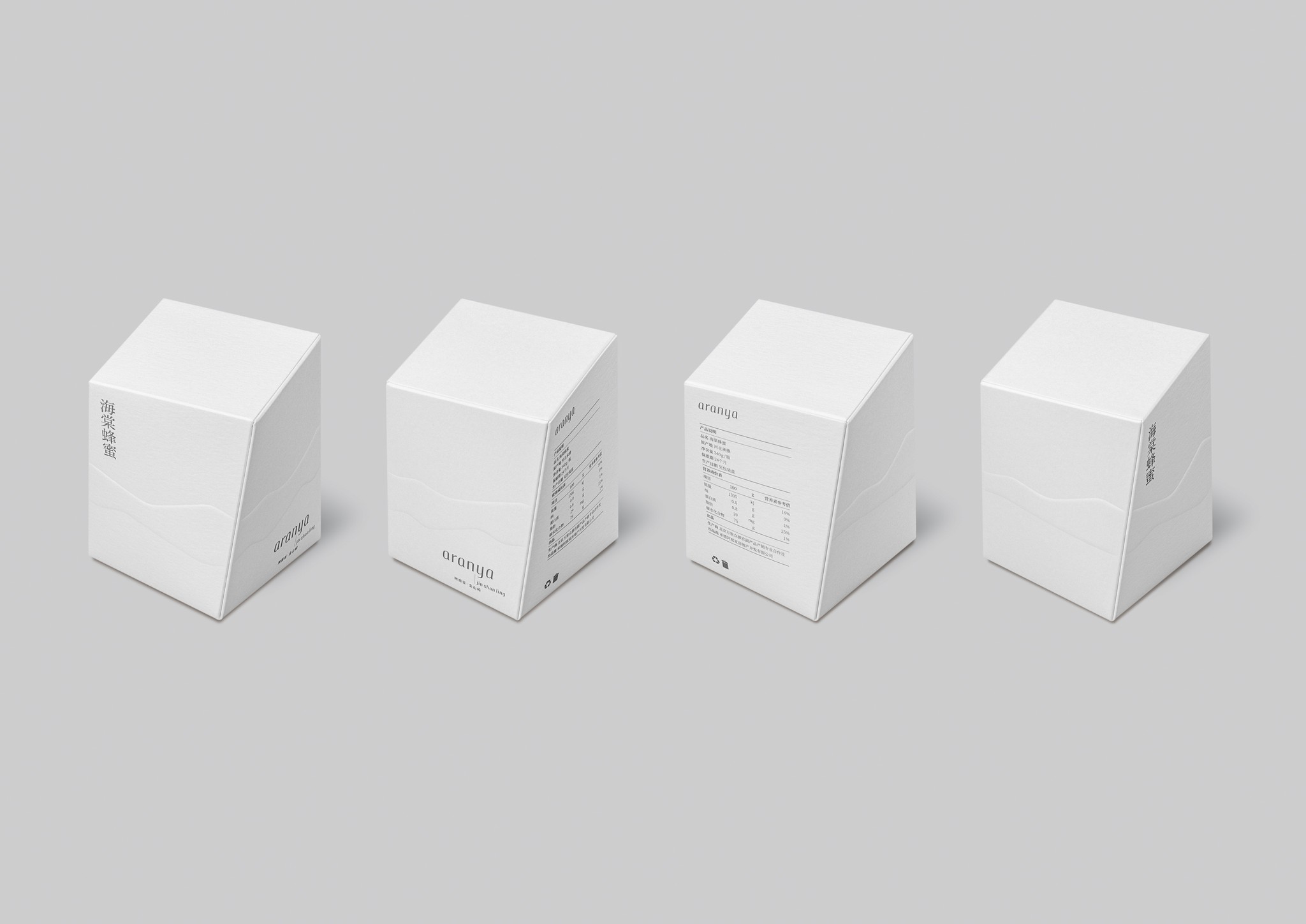
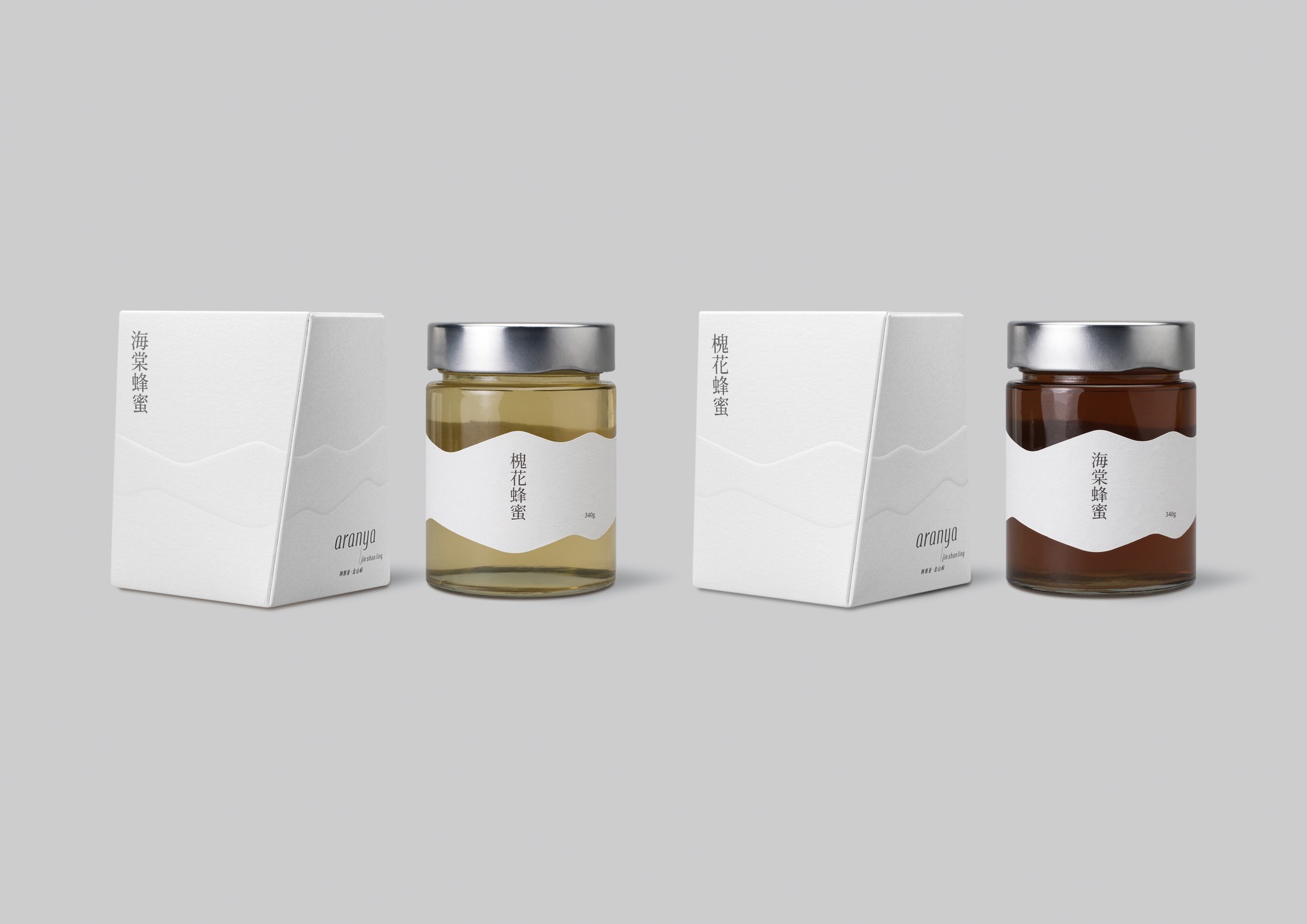
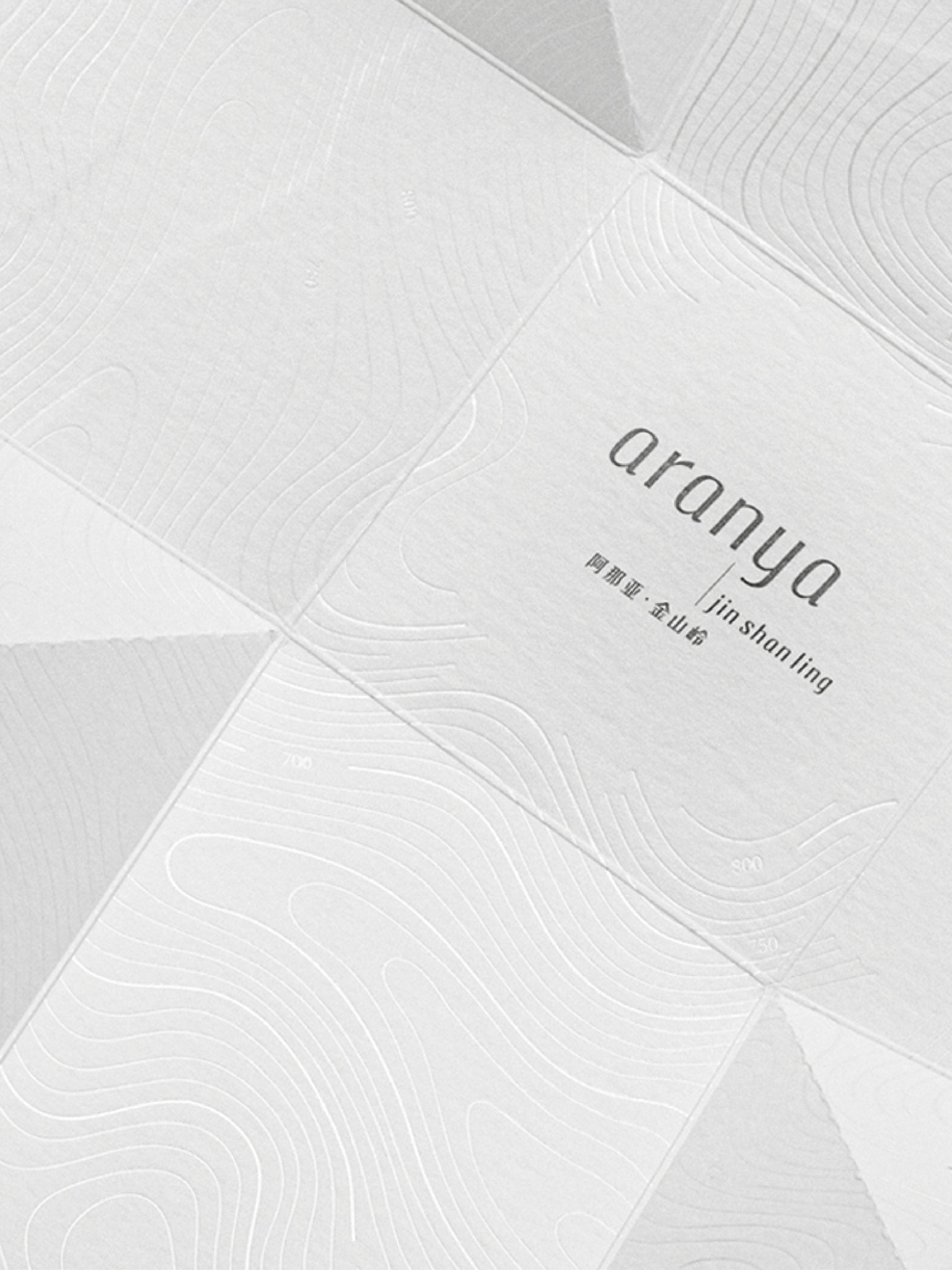
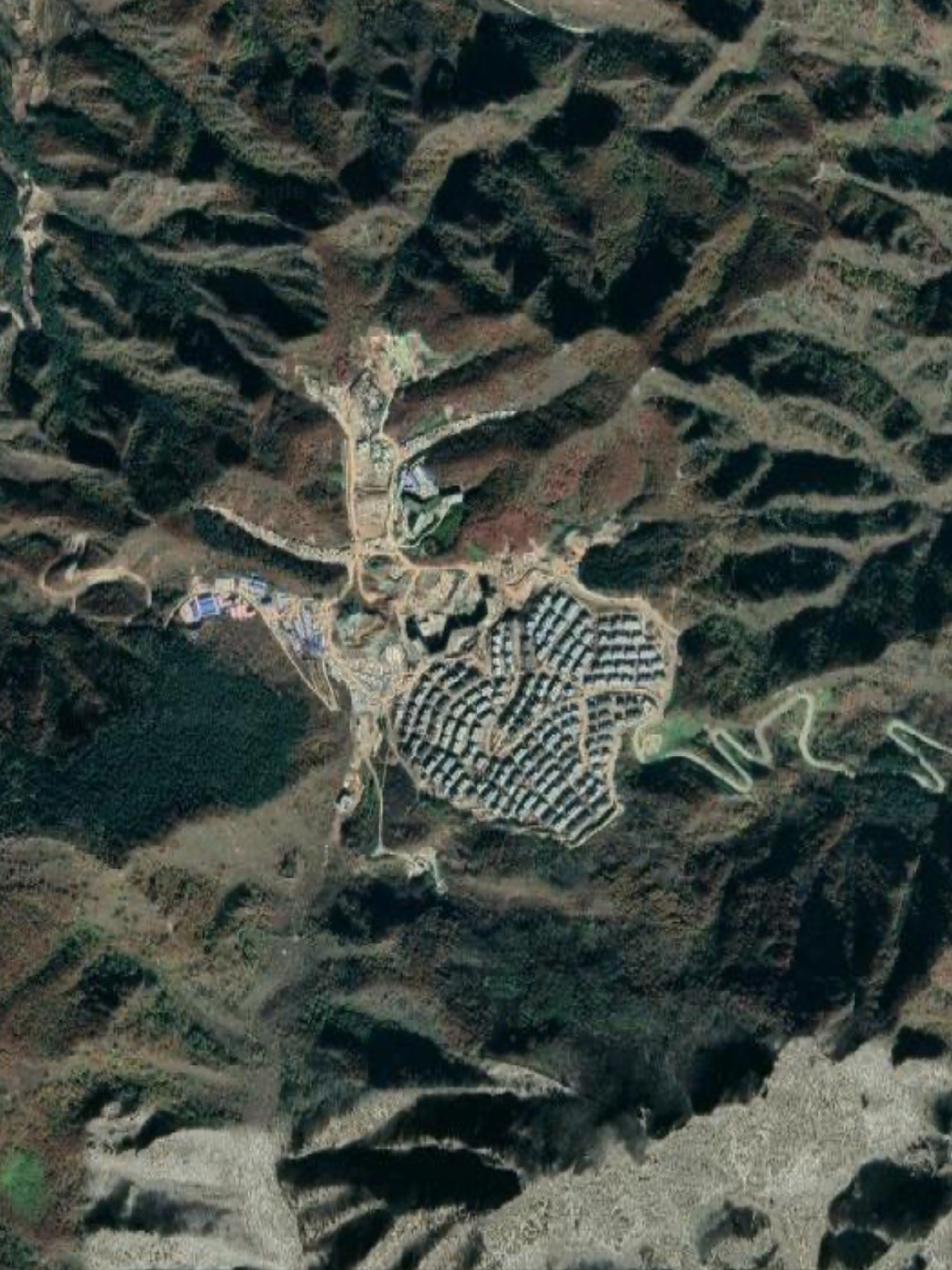
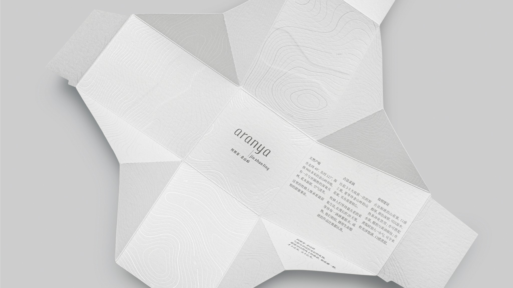
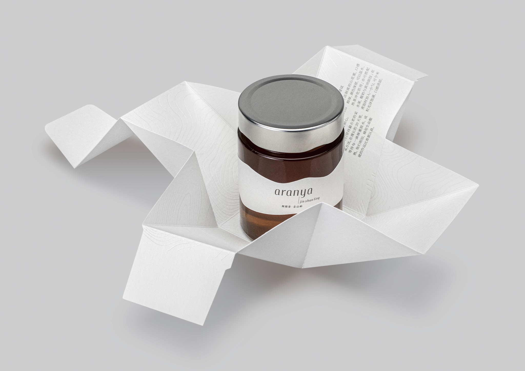
Aranya is a high-grade property developer brand. This packaging was designed for Aranya’s two special honey products from Jinshanling mountain area, where Aranya’s exclusive and environmentally friendly real estate project locates. The creation of outer packaging, twisted oblique shape, was inspired by the italic logotype which is aimed to reflects the brand image; while the design of adhesive-free folding structure conveys the eco-friendly brand value.The graphic of the continually mountains used as the embossed pattern on outer packaging and the shape of the label on honey jars was simplified from the real local mountain view.The topographic contour lines foil stamped on the inside of the outer packaging further advocate the concept of “surrounding by the nature” to the customers.
阿那亚是一个高档地产开发商品牌。这款包装是为其高端生态地产项目「阿那亚金山岭」所在地金山岭当地的两款蜂蜜特产所设计。
盒子的倾斜形状的创作理念灵感来源于品牌的斜体字标志,目的是为迎合其品牌形象。同时,无胶折叠式结构设计传递了其生态友好的品牌价值观。用于外包装上的起凸图案和蜂蜜罐身标签形状的连续的山峰图形是以当地真实山景简化而成。在外包装的内侧烫印的实地等高线图还向用户传达了「被自然包围」的品牌理念。
